

What is the one thing that you think of when you reflect on the previous year? It is possible that what you remember are not things or objects, but rather experiences you went through. This is how humans are designed- we love stories and interactive journeys that engage all our senses.
The same is true for web design. For your marketing site to be memorable, it has to be more than just a static page; instead must contain an experience. Fortunately for us in 2024, it’s simpler now than ever to make your website stand out and get closer to your customers by means of experiential design.
What is an experiential marketing site?
 |
| https://www.engagebay.com |
In a nutshell, an experiential site is not just concerned with a transaction or formality. An experiential site uses rich graphics and different design elements which are playing with concepts such as depth, motion and texture while at the same time using smart copy to evoke emotions or lighten up your sense of humor.
An experiential website can be all encompassing, but it needn’t be so. Even minor adjustments like micro interactions and parallax scrolling can breathe life into a page. To kick it off, here are some of our best examples of experiential marketing sites.
Jasper
 |
| https://www.jasper.ai |
The video, which combines funhouse mirrors and urban drone footage, instantly catches the viewer’s attention on Jasper’s site. When you scroll down past the fold, you’ll see a real-time preview of Jasper’s product where letters are typed on the screen – making users feel as though they have tried out the product firsthand.
DIKO
 |
| https://www.diko.co |
When you think of major dreams in 2024, brand agency websites is a great place for ideas and inspiration. This kind of business usually takes more risks when it comes to creativity, one of them being DIKO. With Warholian colors and a self-conscious ‘This is a paid advertisement’ sticker that unfolds on its pages, the website looks almost like a modern art exhibition. Indeed, this is one site that needs to be seen in real time.
Ramp
 |
| https://ramp.com |
Ramp’s site is a great illustration of how well-chosen design elements can involve the user without detracting from the message. Once you scroll below the fold, the visual blocks within the banner recede to become smaller at the center of that page. It’s a little thing but impossible not to play with repeatedly.
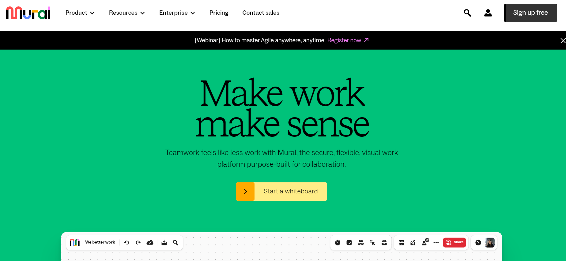
Mural
 |
| https://www.mural.co |
Mural’s website is bursting with bright colors and smart, snappy headline copy that helps the brand personality to shine through. A product preview begins with text and post-it note items flying onto the screen, asking users to play the whole video. Further down the page, there are clickable elements and a bold graphic style which makes it feel like one is interacting with a product and therefore induces its user to continue lingering on this page.
Design elements for experiential sites
 |
| https://www.openlawlab.com |
Rich Graphics
 |
| https://www.animationcoursesahmedabad.com |
Textures and layers of graphics give the illusion of depth, enhancing the visual intricacy in a site. In our post on trends for 2024, we mentioned that sites would turn away from minimalism, towards richer and more colorful designs filled with different textures.
Micro-transactions:
 |
| https://fireart.studio |
Parallax scrolling:
 |
| https://www.website-designers.co.nz |
Kinetic typography:
 |
| https://blog.breadnbeyond.com |
Crafting an experiential site has never been simple
Not anymore are static transactional websites the order of the day. With GPUs as well as processors that load intricate animations fast and modern web browsers that can handle heavy workloads, not to mention generative AI to get your designs off the ground, 2024 is looking like a year where virtually anything is possible.